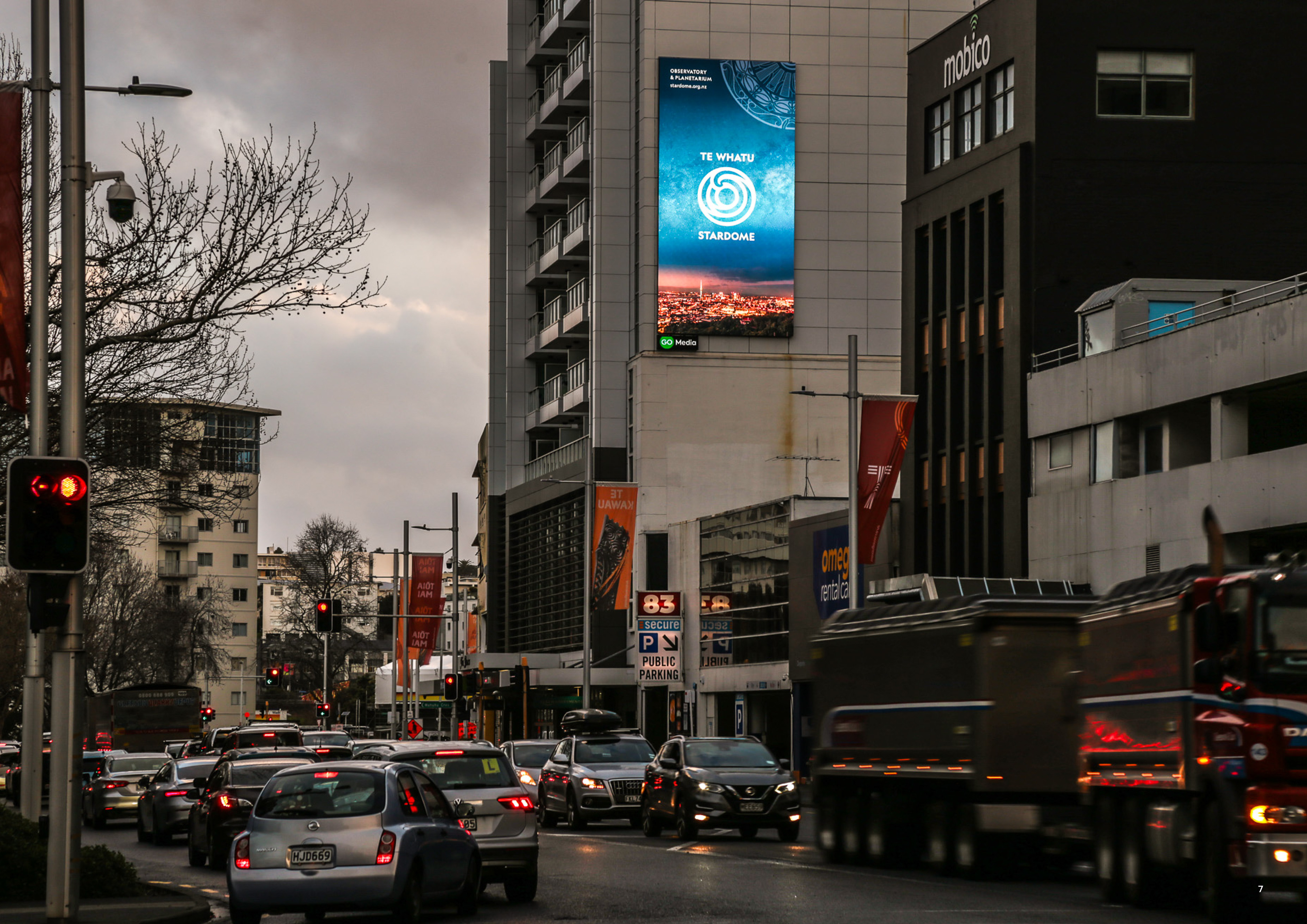
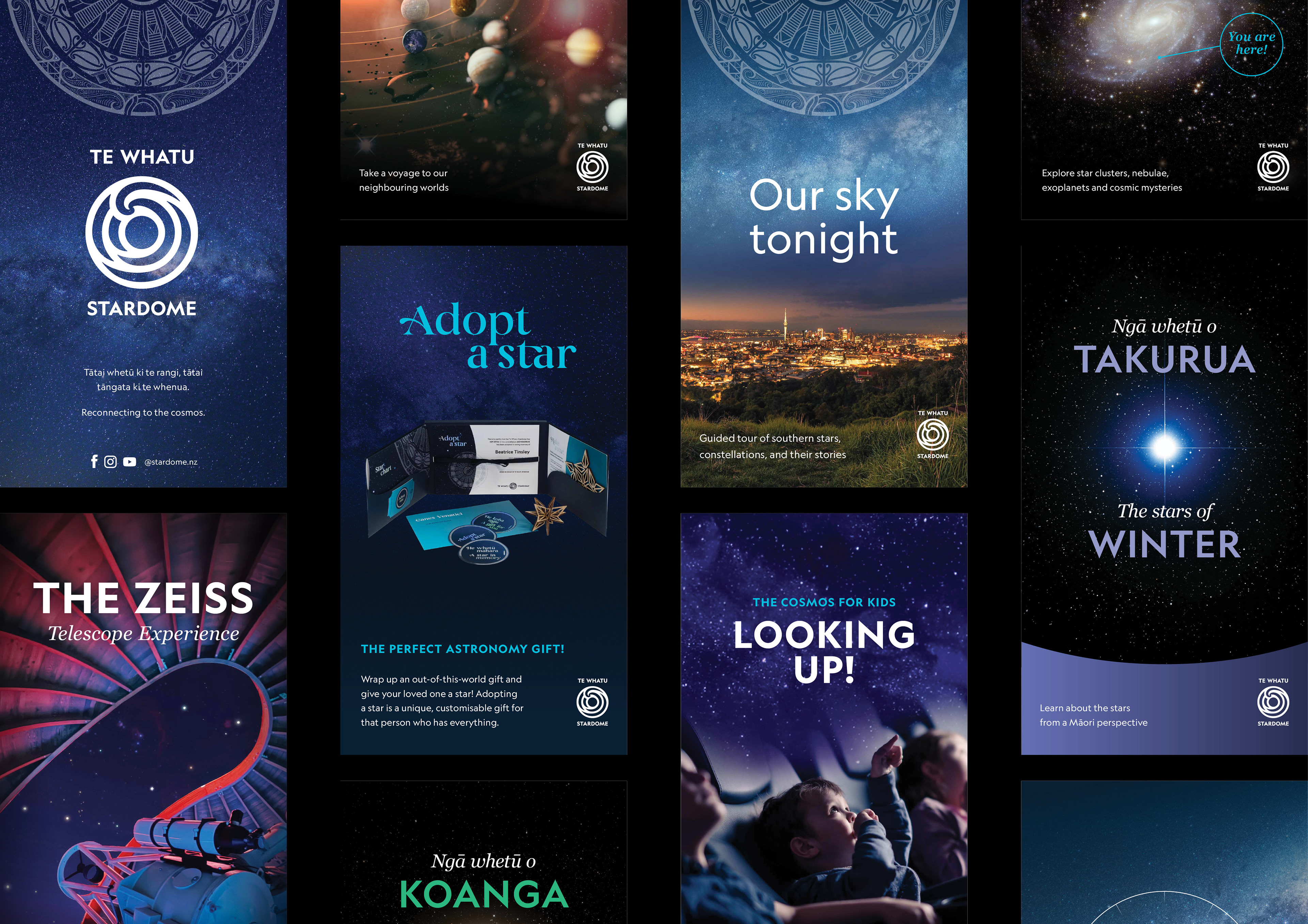
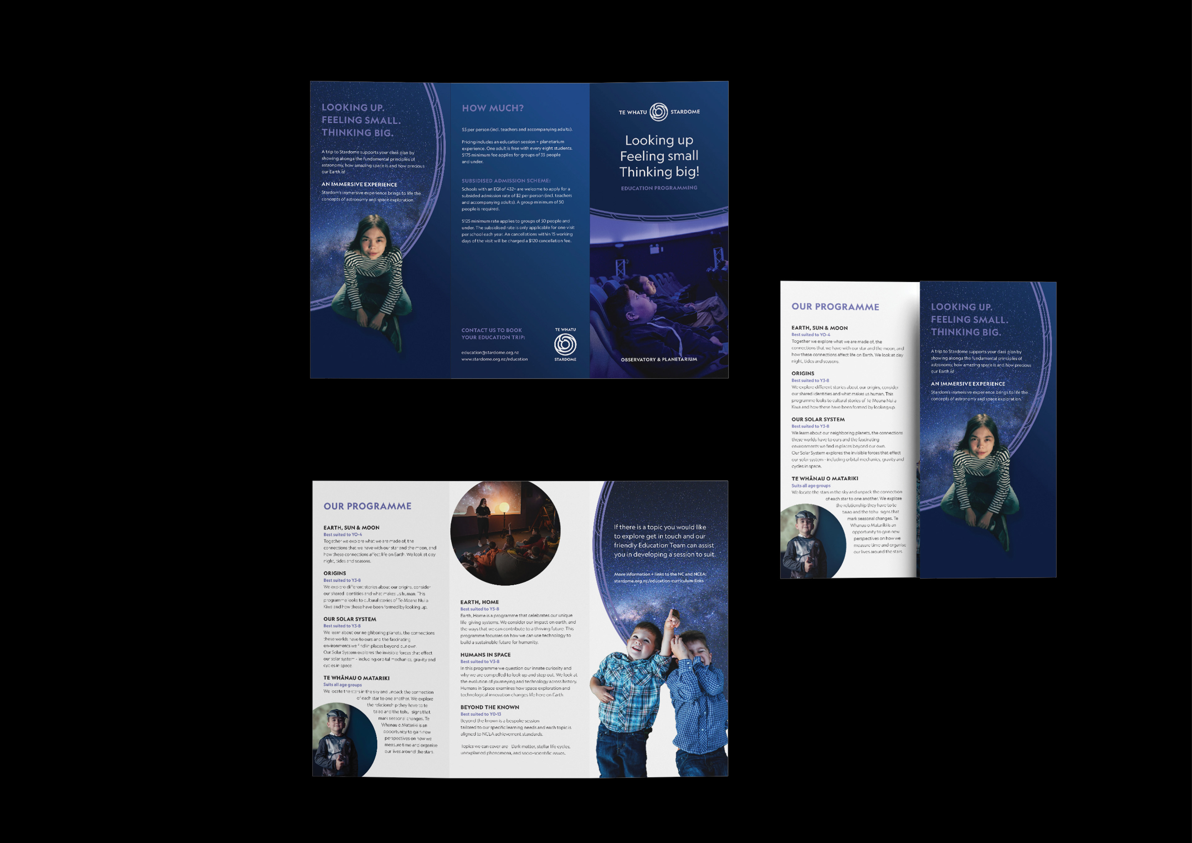
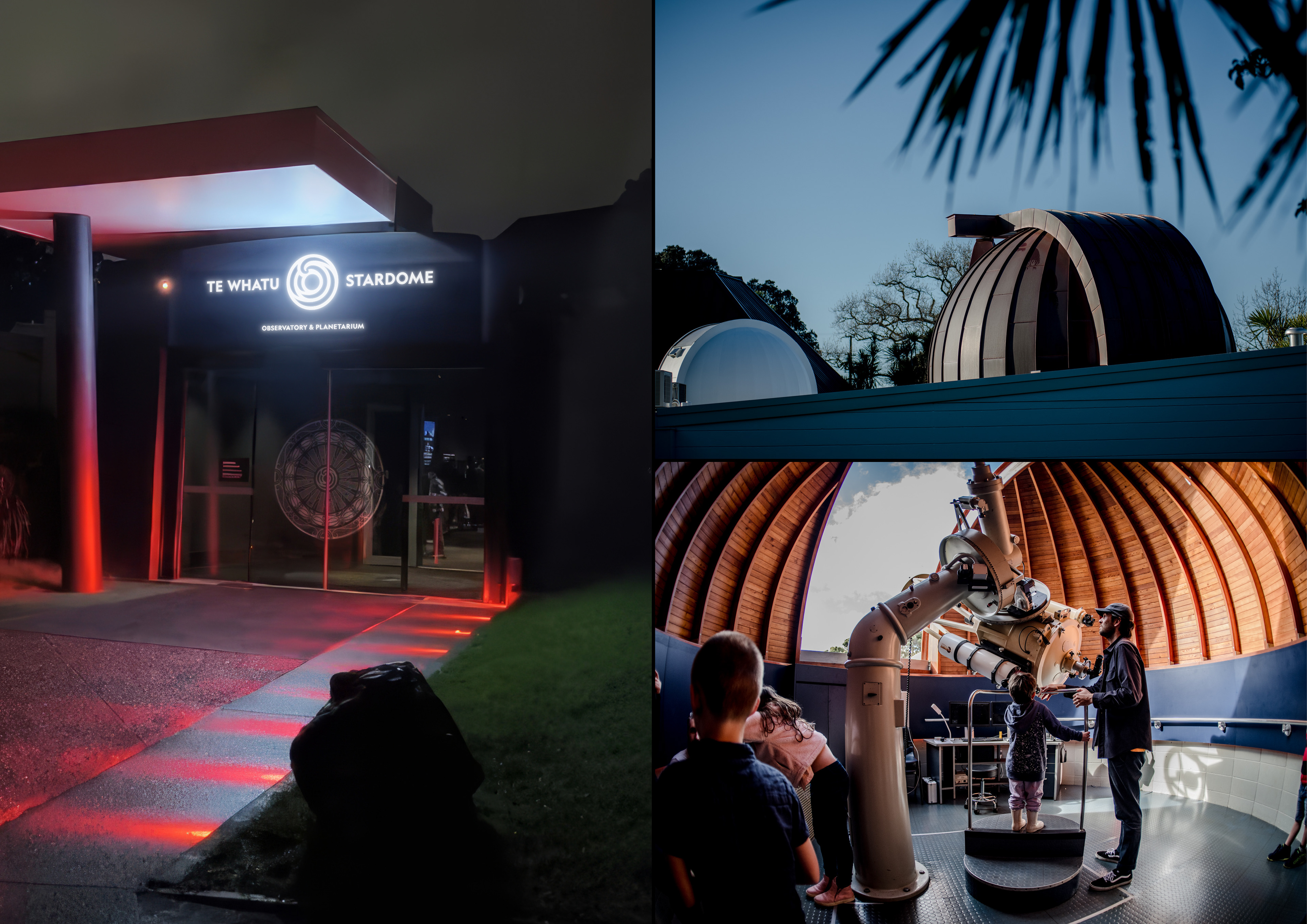
Since 1967, Stardome has stood at the base of Maungakiekie, looking up at the skies above Tāmaki Makaurau. In August 2025, at first light on the maunga and in partnership with Ngāti Whātua Ōrākei, it revealed a new name: Te Whatu Stardome. The renaming is the culmination of a five-year journey to embrace biculturalism, embed mātauranga Māori, and honour its commitment to Te Tiriti o Waitangi as kaitiaki of this sacred maunga. We were engaged to translate that commitment into a complete visual identity.
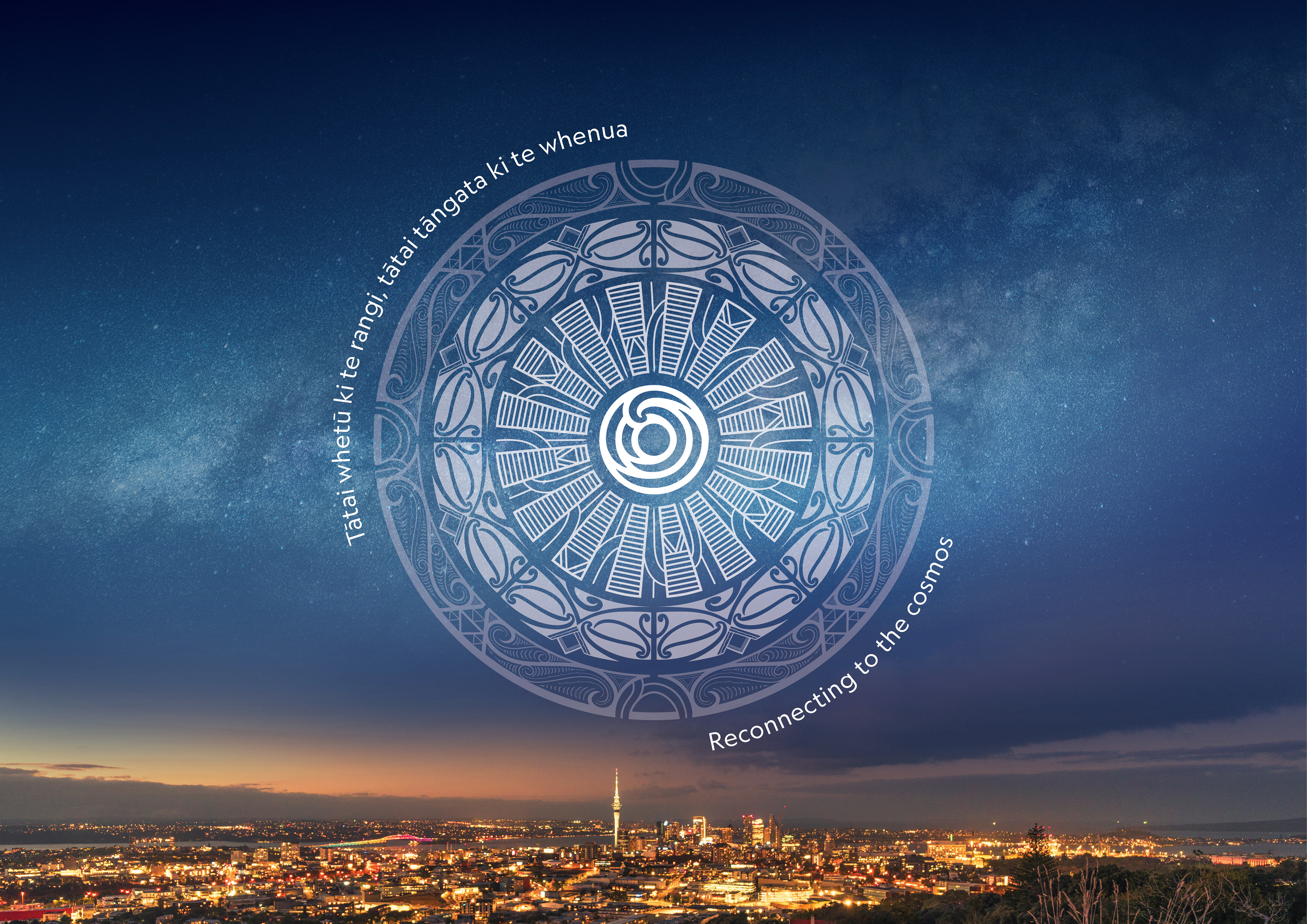
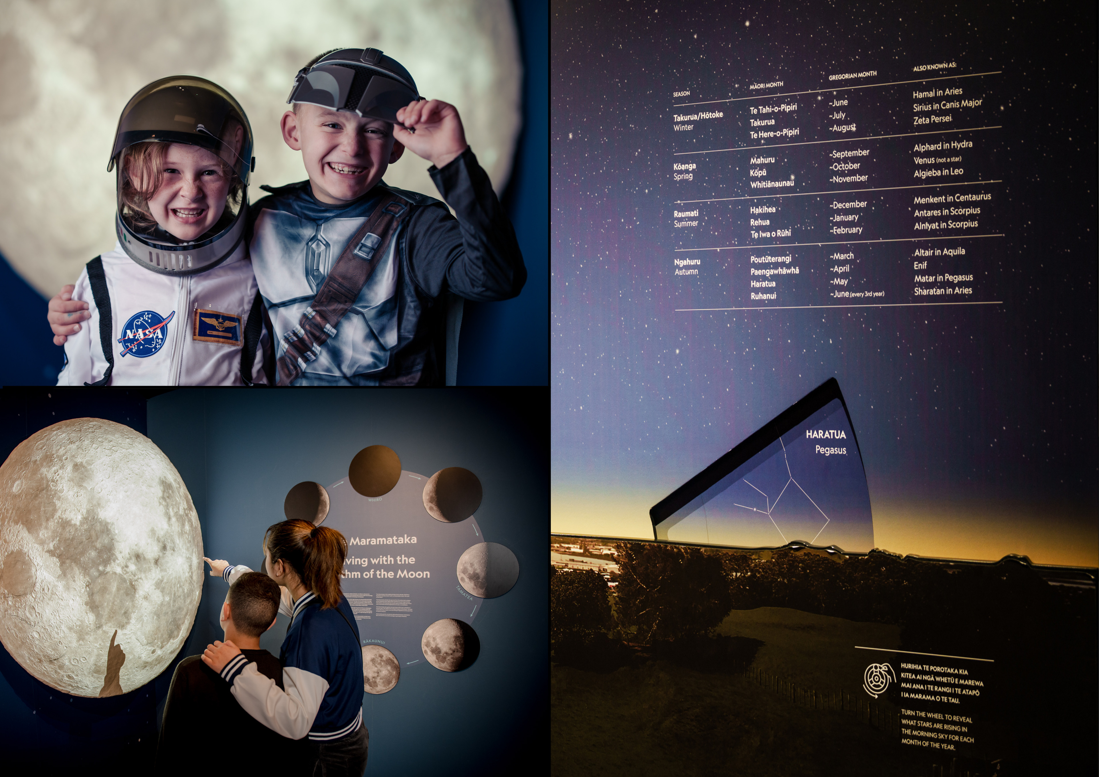
This identity did not begin with a logo. In 2023 we worked on the 2D design with Stardome on a gallery redevelopment that placed mātauranga Māori alongside Western science. The organising whakataukī of those galleries – Tātai whetū ki te rangi, tātai tāngata ki te whenua, the lineage of stars above mirrors the lineage of people below – became the kaupapa tagline at the heart of the brand, speaking to whakapapa and the connection between people, place and the universe. The central idea, 'the eye' – Te Whatu – speaks to the multiple lenses through which we explore the cosmos.
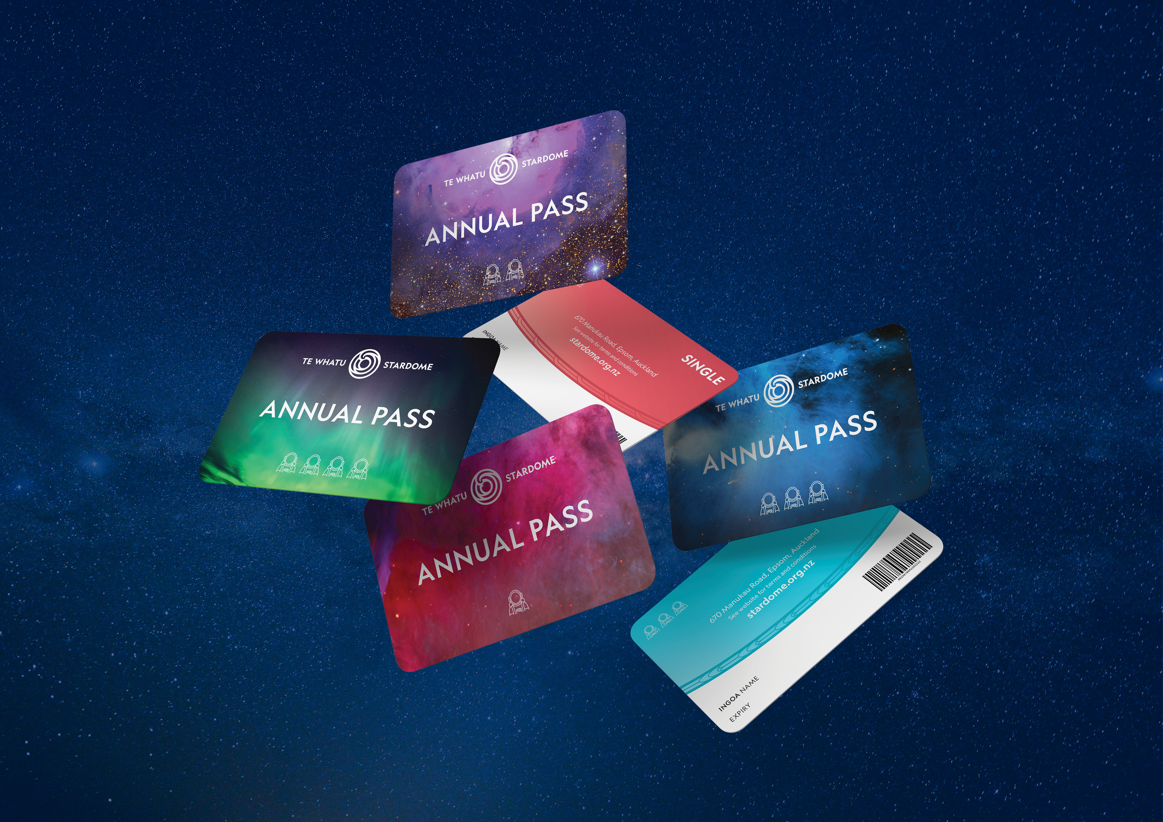
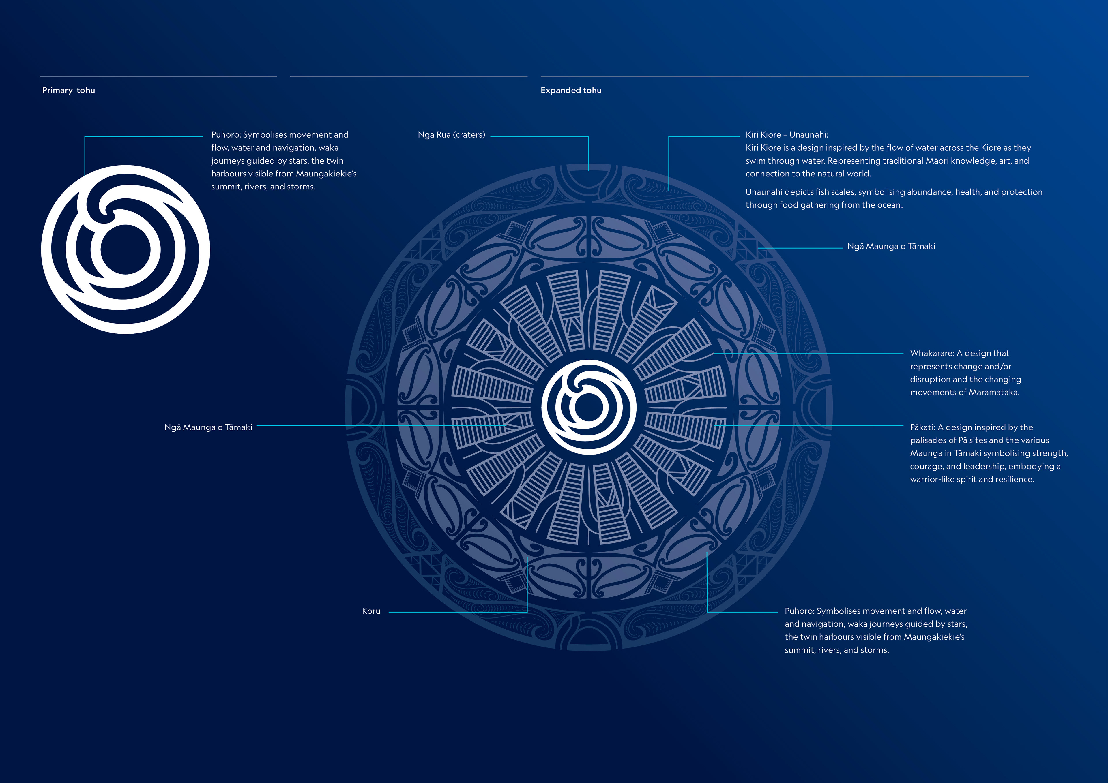
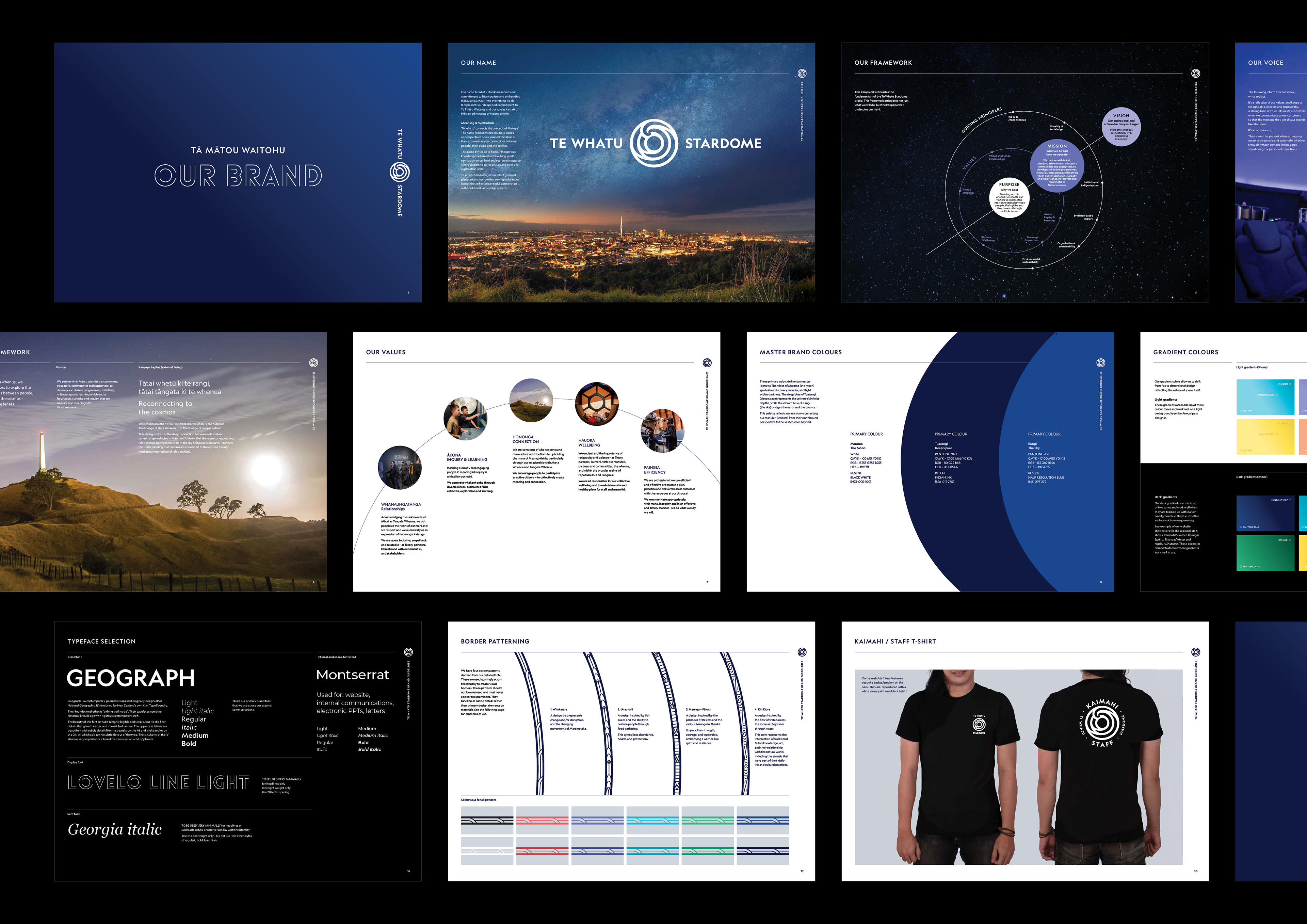
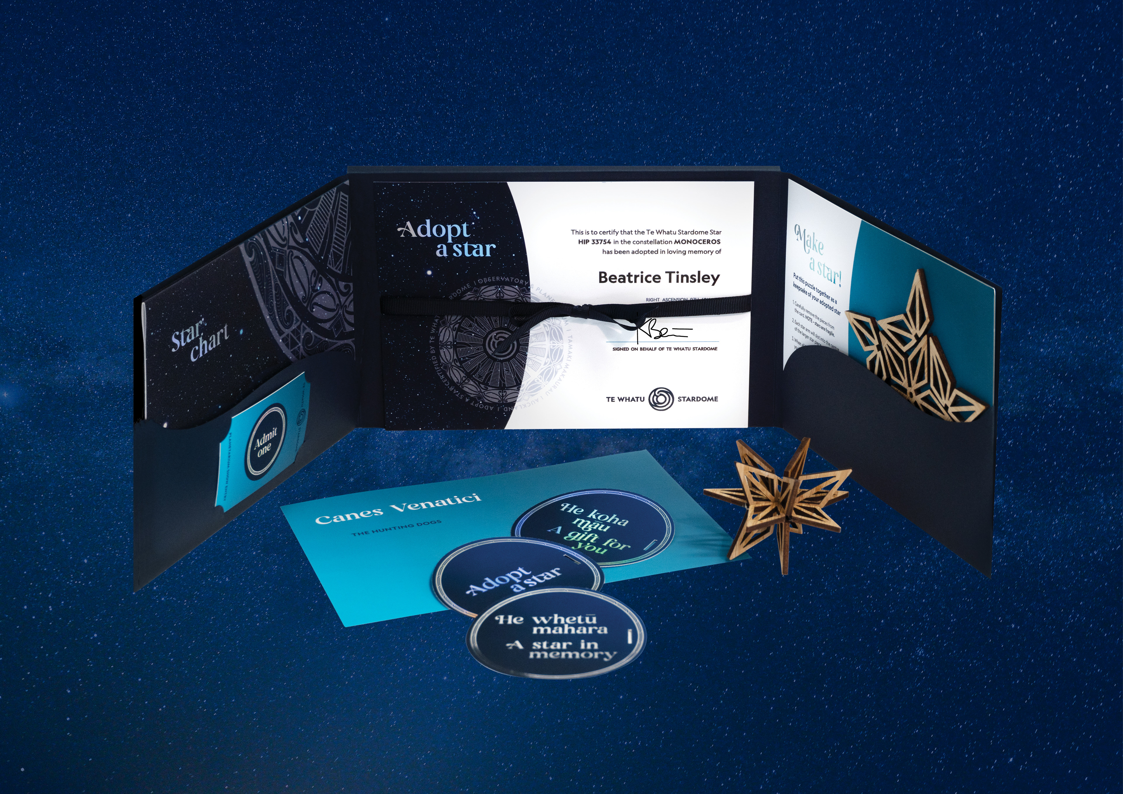
At the heart of the brand are the tohu created by Graham Tipene (Ngāti Whātua Ōrākei, Ngāti Kahu, Ngāti Hine, Ngāti Hāua, Ngāti Manu). The primary tohu draws on the puhoro – movement, water and navigation – acknowledging waka journeys guided by the stars and the twin harbours seen from the summit. The design links the concept of 'the eye' to the phases of the maramataka, the cycle of life death and renewal within the cosmos and on Earth, planetary orbit, and relates to the physical; an aerial view of Maungakiekie, and the telescope dome on the roof of Stardome itself. The expanded tohu features unaunahi, pākati, whakarare and kiri kiore, each carrying meaning reflected in patterning across the identity. A master palette of Marama (the moon), Tuarangi (deep space) and Rangi (the sky) is supported by a solar-system palette and dimensional gradients. Klim Foundry's Geograph font anchors the typography, its circular 'o' nodding to orbits. From tickets and education material to merchandise, signage and the 'Adopt a Star' range, every touchpoint carries the same kaupapa. Throughout, our responsibility was to apply the tohu and patterning without diluting or decorating over its meaning – an identity that reflects the significance of the place from which it speaks.
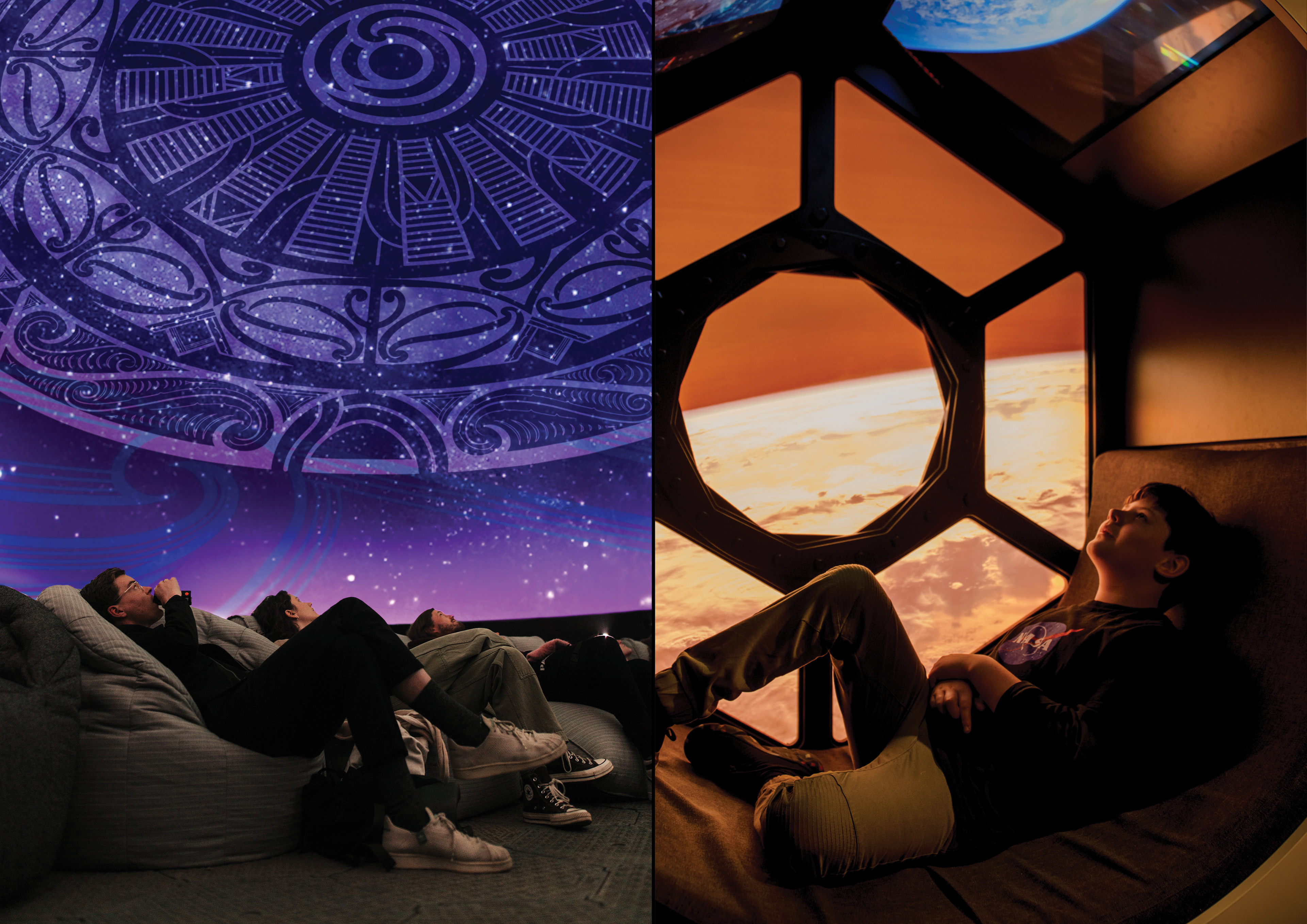
This is a brand built to hold Indigenous knowledge and cosmological science side by side. Like the puhoro it draws from, the identity is built to move: the tohu – the lens of Te Whatu – flows across every encounter, rippling both skyward and inward, to the whenua and to learning. Each ring of the expanded tohu holds a story, a different lens that rewards a closer look, and the kaupapa is carried not as a tagline to read but as a thread manuhiri move through. The rebrand is a visible expression of a wider organisational transformation, and a demonstration of how genuine community engagement and cultural partnership can shape identity.
Cultural Lead/ Artist: Graham Tipene (Ngāti Whātua Ōrākei, Ngāti Kahu, Ngāti Hine, Ngāti Hāua, Ngāti Manu)