Where blueprints meet bytes—transforming construction's analog chaos into spatially intelligent digital twins that bridge the gap between what's built and what's possible.
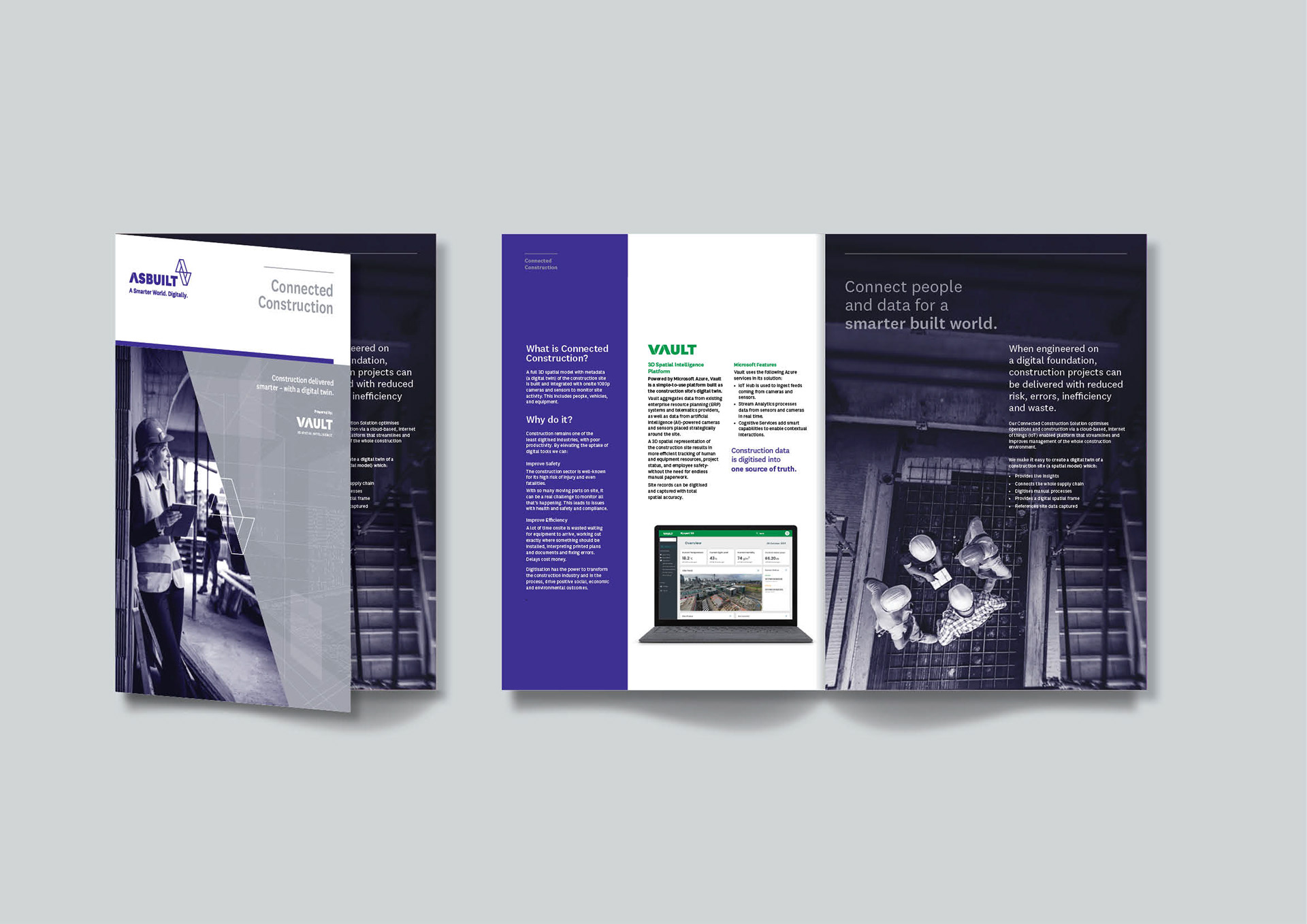
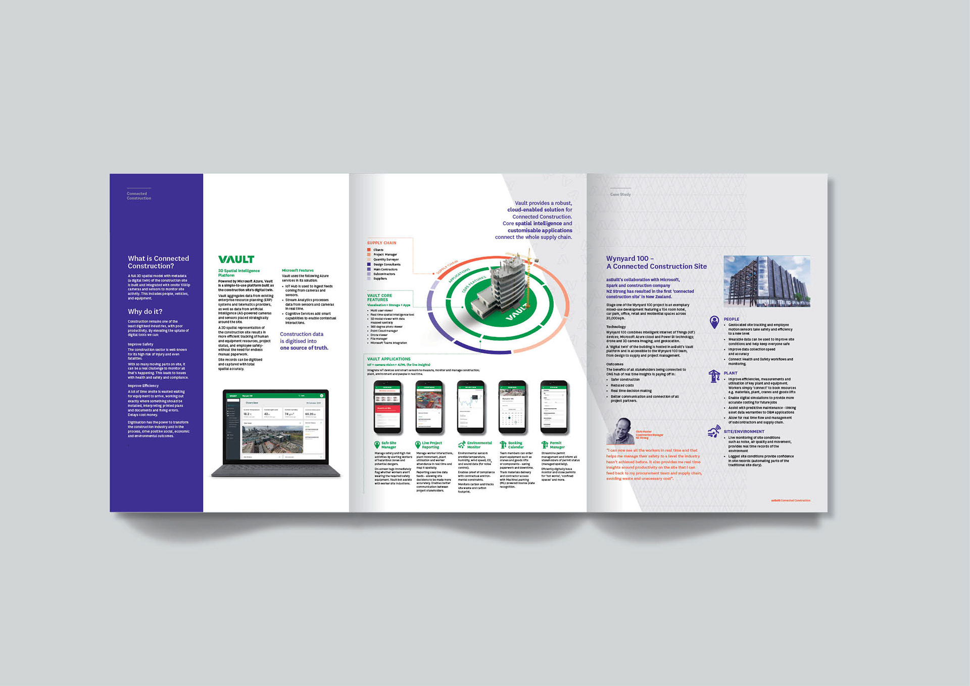
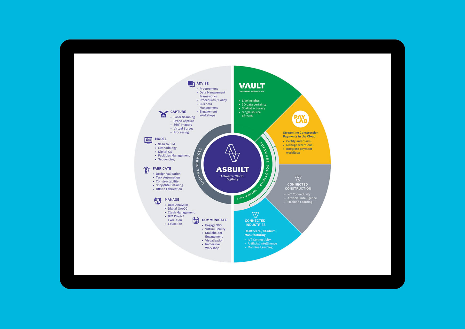
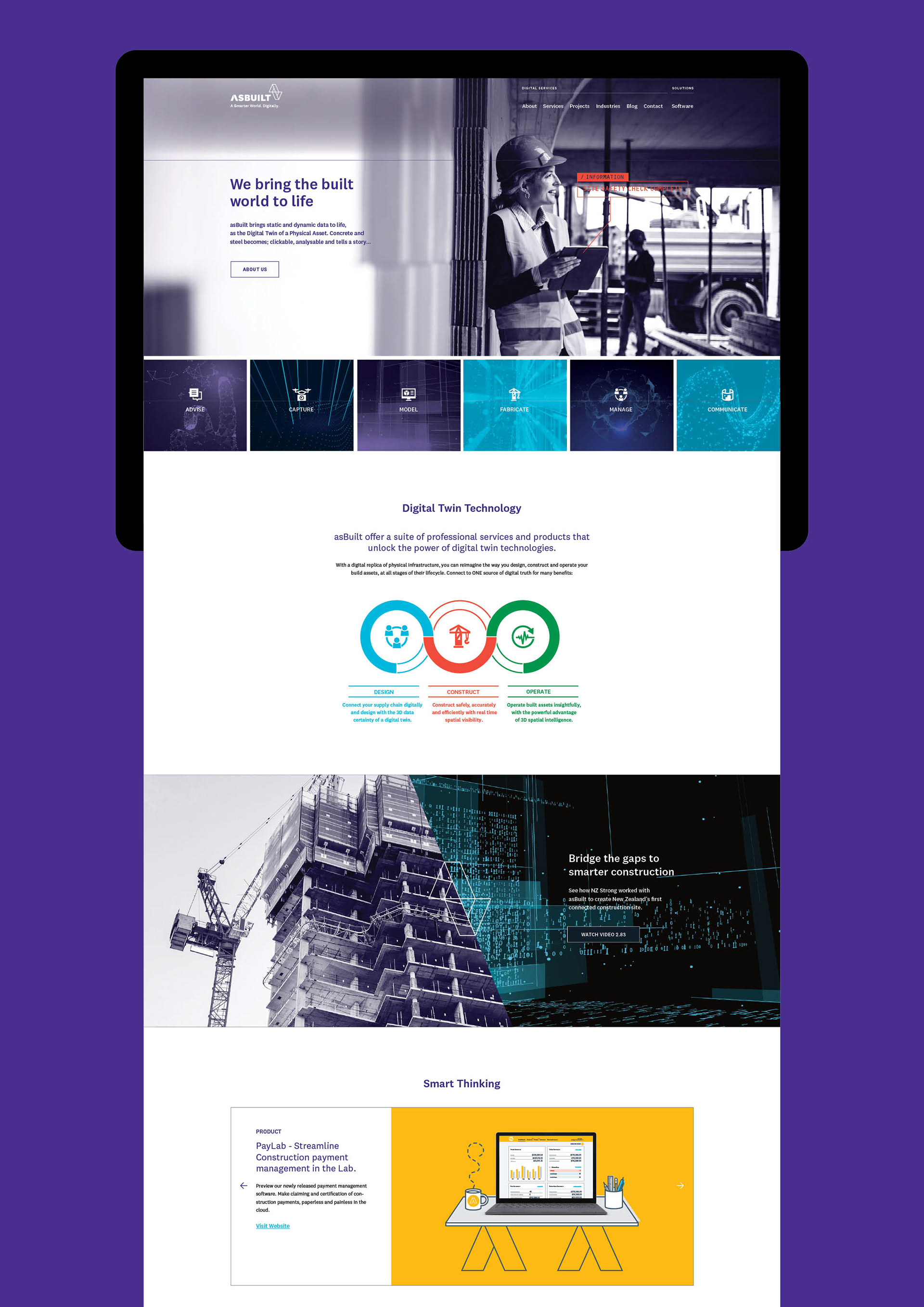
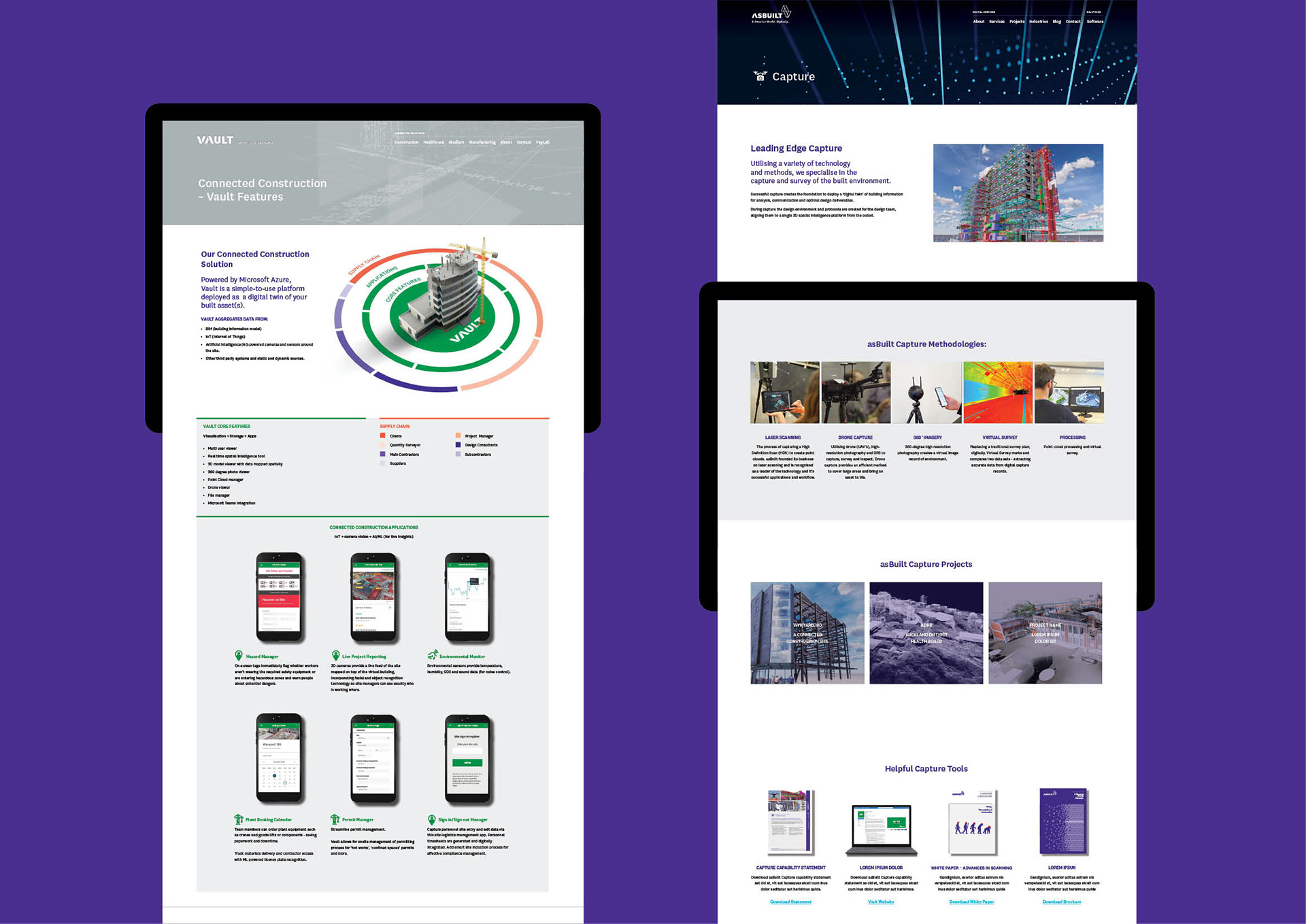
Asbuilt is a digital engineering company revolutionising how people interact with the built world through intelligent software solutions. Their flagship platform Vault serves as a 3D spatial intelligence engine that ingests, analyzes, and organizes BIM data to create digital twins of any built environment. Acting as a spatial data lake, Vault connects with other software through APIs and integrations, transforming raw construction data into spatially intelligent insights.
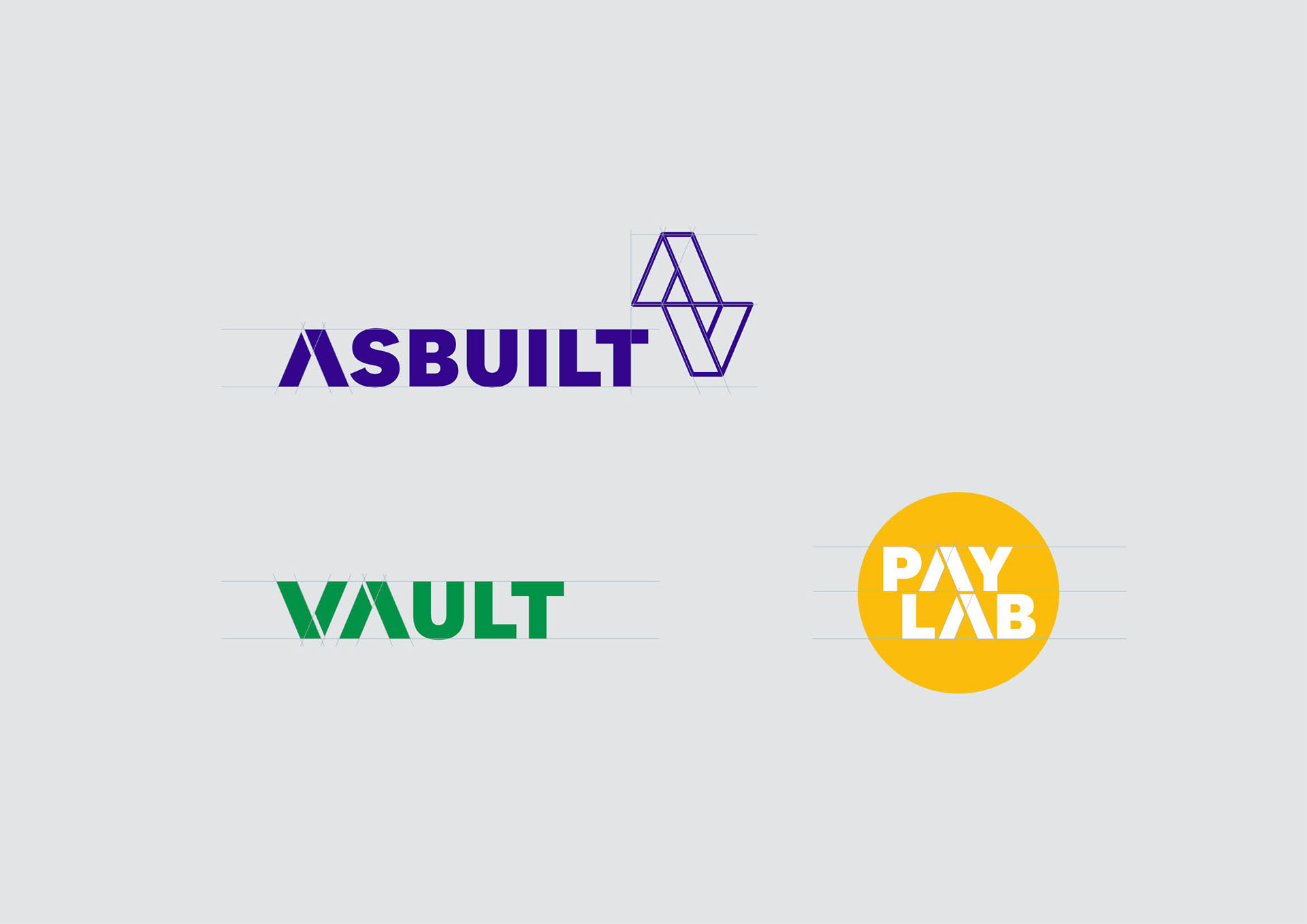
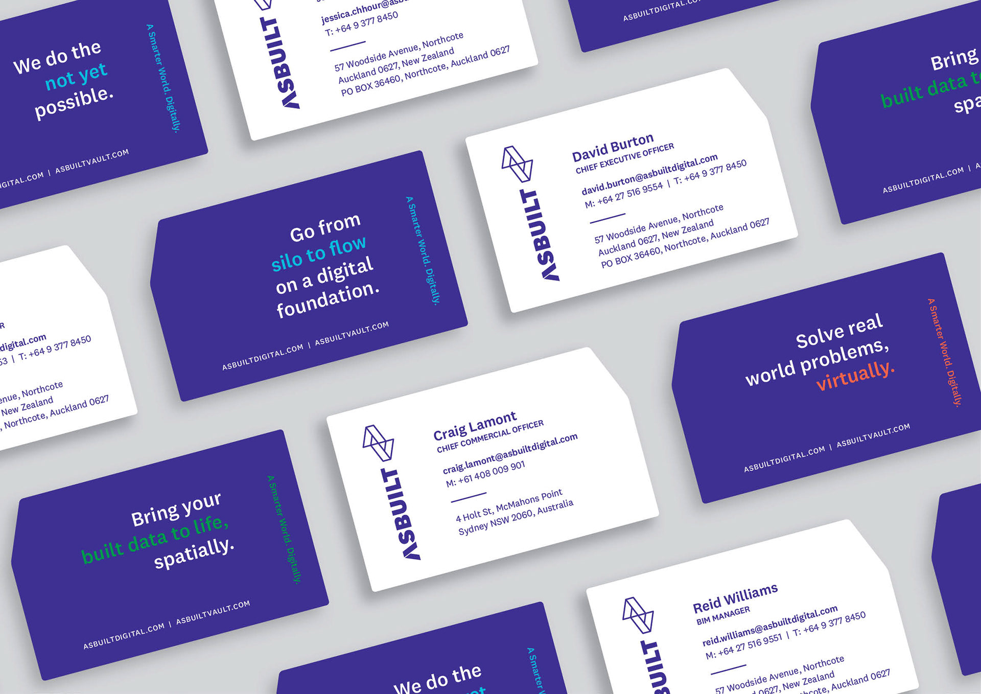
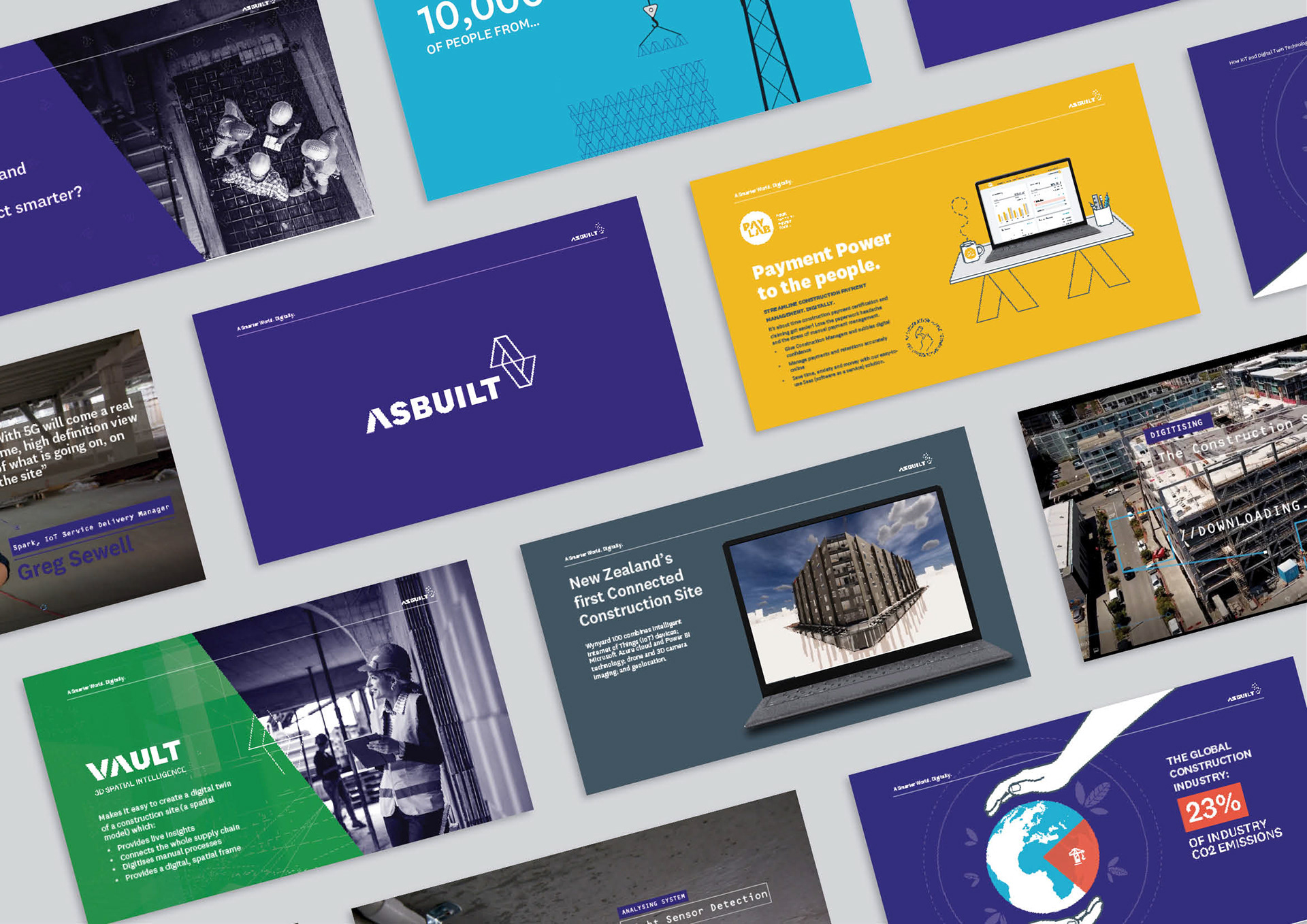
The brand identity challenge required creating a parent brand that embodied Asbuilt's core values—strong, practical, candid, technical, and visionary—while developing cohesive sub-brands for Vault and PayLab that could function independently yet remain visually connected. The solution centers on a reflected monogram symbol representing digital twin technology through perfect symmetry and seamless connection between physical and digital worlds.
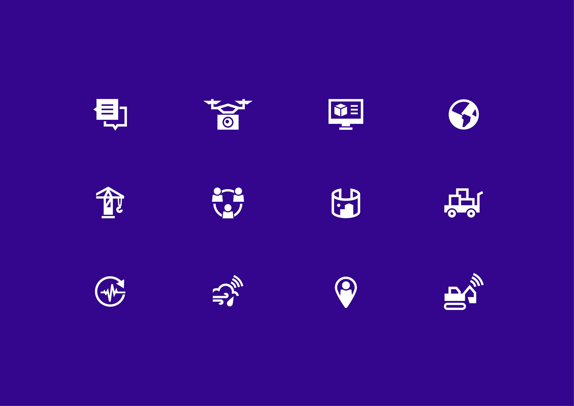
Color became the differentiating vehicle for each software brand. Asbuilt's parent purple draws from blueprint heritage, Vault's bold emerald green conveys security and sustainability, while PayLab's vibrant yellow radiates energy and connects to construction's iconic hard hats and machinery. Bold iconography, duotone photography, and digital textures create a cohesive ecosystem where the interplay between real and digital worlds becomes a defining design motif throughout all communications.
Agency: Brandwell