Where ampersands bloom—transforming punctuation into poetry through elegant typography that makes business beautiful.
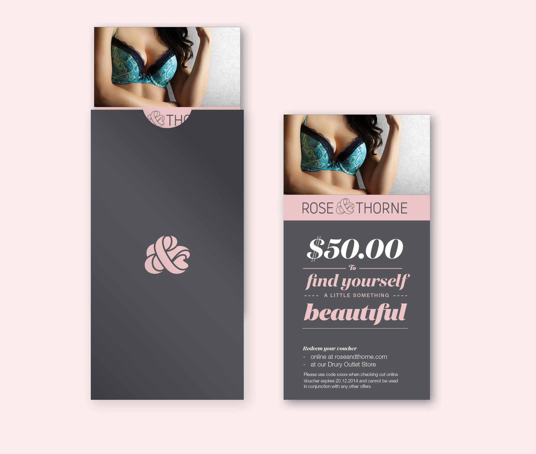
A soft new look for Rose & Thorne featuring a vibrant logo evolution where the ampersand gracefully transforms into a floral form, creating an organic symbol that captures the brand's elegant yet accessible personality. The comprehensive identity system extended across swing tags and stationery, employing Klim's beautiful Domaine Display typeface to establish a refined, feminine aesthetic that remains approachable and welcoming. The design approach balances sophisticated elegance with vibrant energy, creating a cohesive brand experience that speaks to diverse customers while maintaining commercial versatility.
Agency: String Theory